
Where Does Your Organisation Sit?
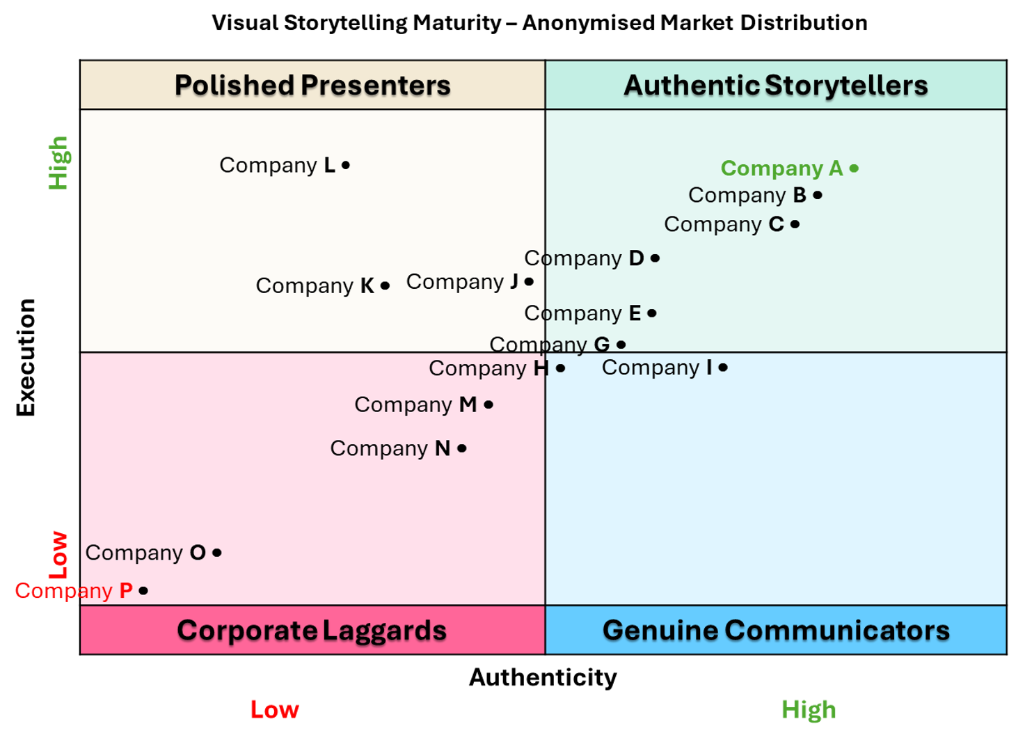
Last year I reviewed fifteen Western Canadian organisations against a structured audit framework — energy, infrastructure, municipal, professional services. I plotted each one against two axes: execution quality and visual authenticity. Four quadrants emerged. Most organisations sat in the same one.
Before I describe the quadrants, it is worth being precise about what the two axes measure.
Execution quality covers the technical and production standard of the imagery: lighting, composition, resolution, design integration. High execution means the photography looks professionally produced. Low execution means it does not.
Visual authenticity covers the evidential weight of the imagery: whether the photographs show real people doing real work in real environments, or whether they are staged, generic, or sourced from a stock library. High authenticity means the images could only have come from that organisation. Low authenticity means they could have come from anywhere.
These two axes are independent. An organisation can have high production values and low authenticity. Many do.
The Four Quadrants
Polished Presenters
High execution, low authenticity. The photography is technically accomplished. The stories it tells are not quite real. These organisations have the budget and the production values. They are spending them on the wrong brief.
Authentic Storytellers
High on both axes. Real environments, real people, real work — and the photography quality to do it justice. A small cluster in the review. Worth studying.
Corporate Laggards
Low on both axes. Stock imagery, inconsistent quality, no visual arc. The gap between what the written narrative claims and what the images show is wide and immediately visible.
Genuine Communicators
High authenticity, lower execution. The intent is right. The photography has not caught up yet. These organisations are often the most responsive to a different brief.
Where Most Organisations Landed
The majority of the fifteen organisations I reviewed sat in the Polished Presenters quadrant.
High production values. Low emotional truth. The investment is there. The direction is off.
This is not surprising. Photography briefs for corporate reports are typically written by communications teams, approved by legal, and handed to a production company whose job is to deliver images that look professional. Nobody in that chain is asking whether the images carry evidential weight.
The result is technically accomplished photography that fails to do the one thing a stakeholder actually needs it to do: prove that the organisation's commitments are real.
What Changes the Quadrant
Moving from Polished Presenters to Authentic Storytellers does not require a bigger budget. The production investment is already there.
It requires a different brief. One that asks what the images need to prove, not what they need to look like.
That is a strategic question, not a creative one. And it is the question Project Authenticity is designed to answer.
If you want to know where your organisation sits, an audit establishes that precisely — with a scored analysis across six criteria and a mapped position on the quadrant.
About Project Authenticity
Project Authenticity is a structured audit framework for corporate and ESG visual communications. It scores reports across six criteria on a 30-point scale, producing an Authenticity Index that identifies where the gap between written narrative and visual evidence is widest. The quadrant model was introduced in the December 2025 newsletter. Audits are now conducted under PA 2.0, which added Indexicality as a sixth criterion.
Originally published: LinkedIn / The Story That Shows, 5 March 2026